.svg)
Get Started
Put these insights to work.
Tak through what you are reading with the practitioners who wrote it.
We partnered with Hutchinson Regional Healthcare System to build the brand foundation needed to unify their organization, strengthen community trust, and position for sustainable growth across rural Kansas.

HRHS delivers exceptional care across maternity, family practice, urgent care, palliative support, and hospice. Patients who visited were consistently surprised by modern facilities, caring staff, and comprehensive services. But many in the community still saw HRHS as outdated, a last resort rather than a choice. The organization had grown significantly, and the brand system needed to catch up. With guidelines originally built 13 years ago and teams distributed across multiple service lines, there was an opportunity to create consistency, improve internal alignment, and give staff the tools and language to become effective ambassadors in the community.
We spent 2.5 days on-site in Hutchinson with clinical ops, nursing leadership, executives, marketing teams, HR, and recruiting staff. Our goal was to create alignment and understand what HRHS does and what it means to the people who work there and the community they serve.
Five brand tenets emerged from our sessions: Family & Continuity, Compassion & Warmth, Kansas Rural Pride, Progress That Matters, and Freedom & Lifestyle. All grounded in what nurses, providers, and support staff already believed about the work they do.
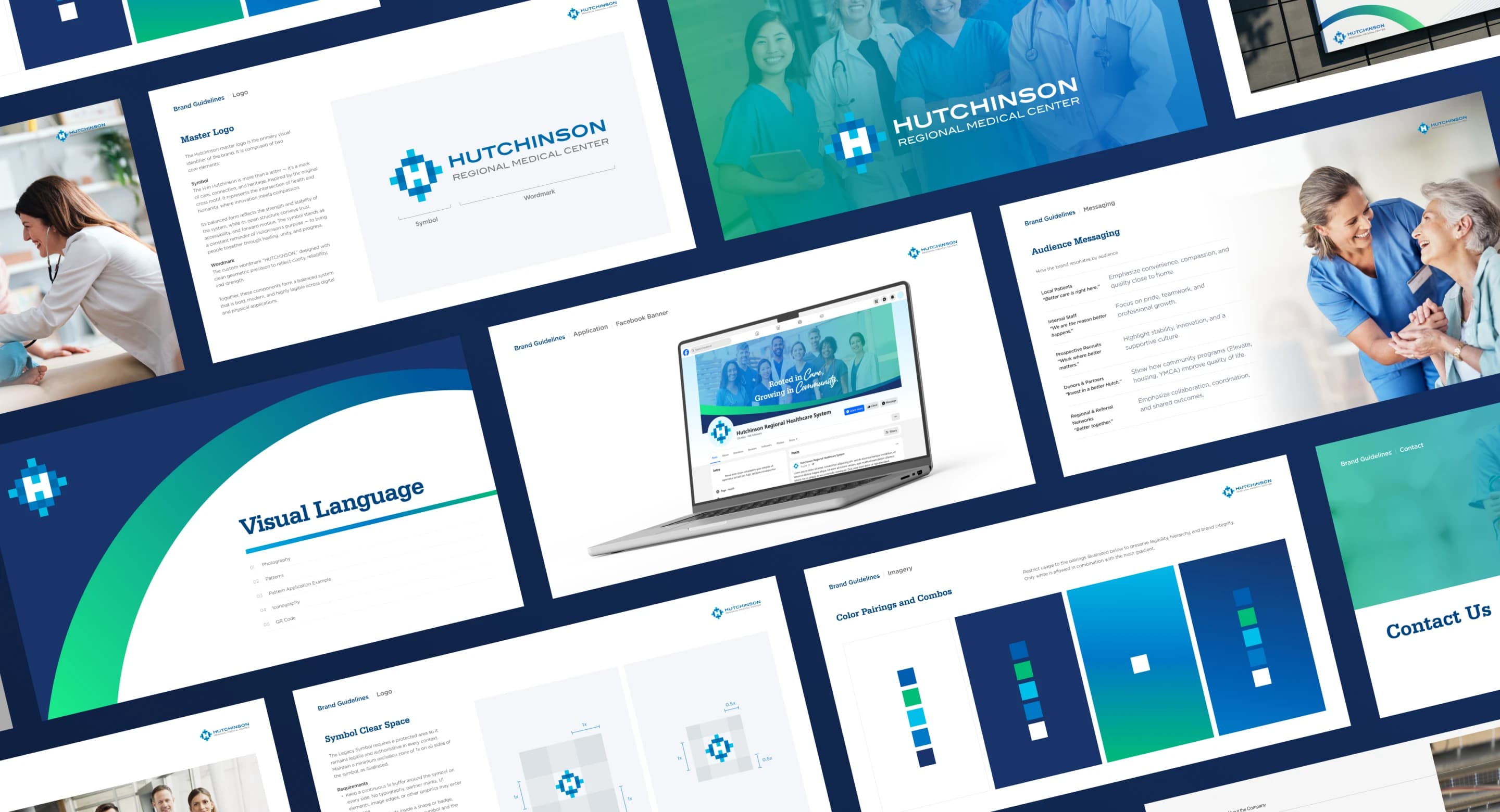
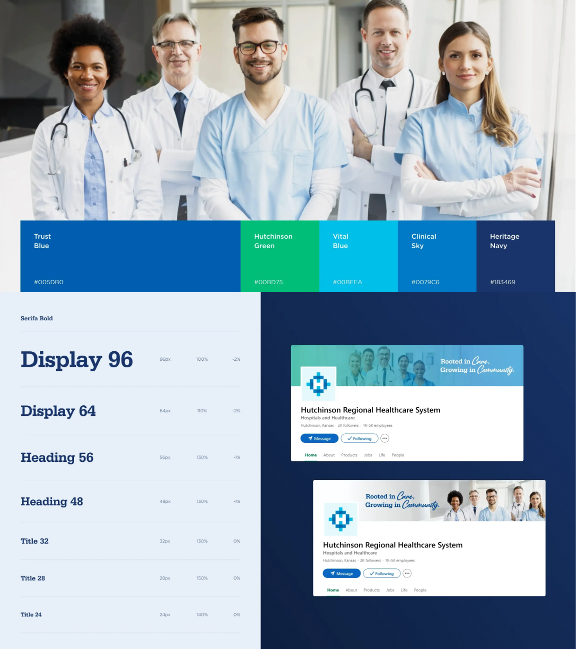
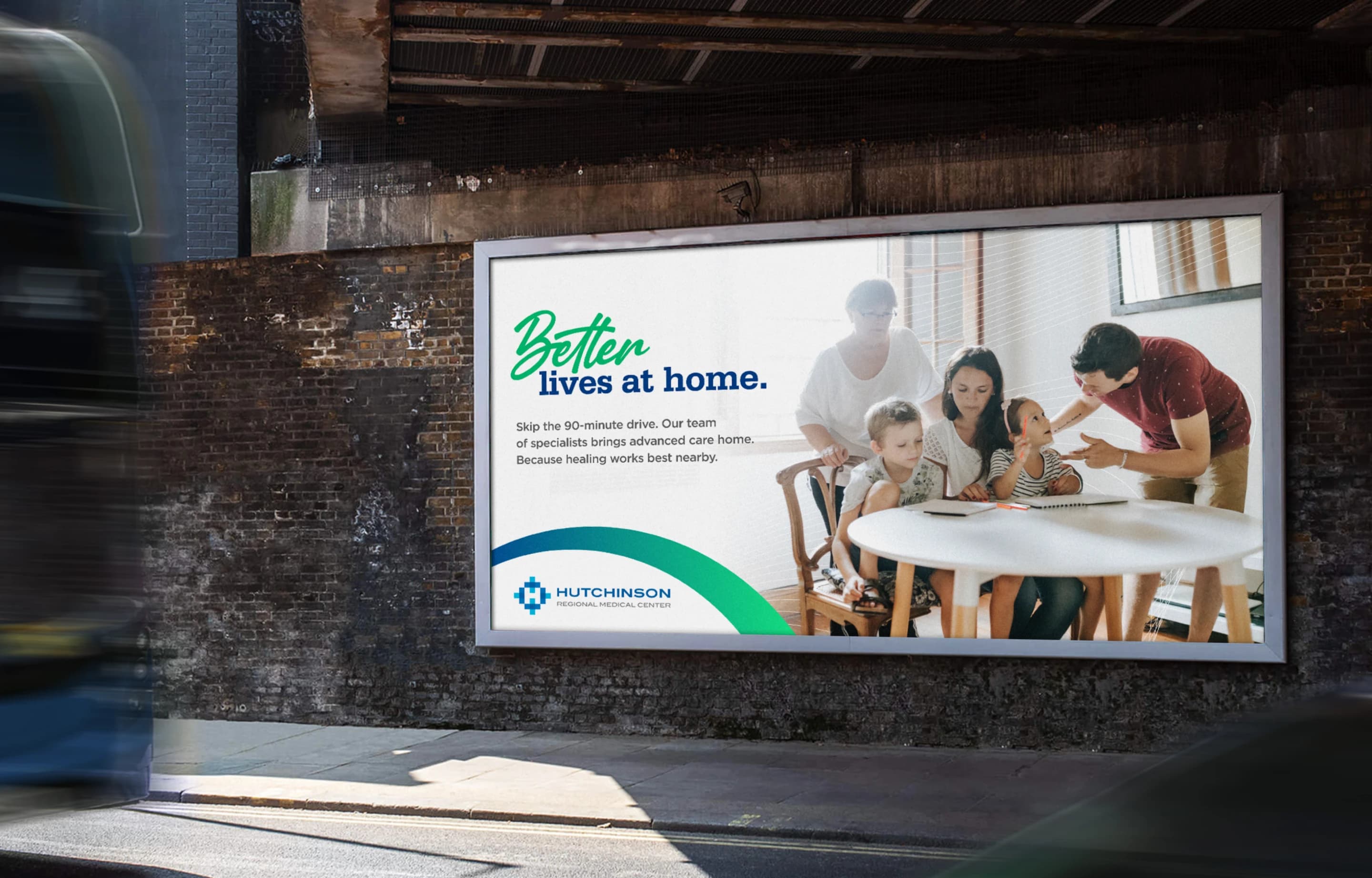
"What should the HRHS logo mean when it's seen on a Little League jersey?" became our north star. We refined the existing logomark while expanding the identity system for modern channels with an extended color palette, accessible typography, layout standards, and photography principles.
.jpg)
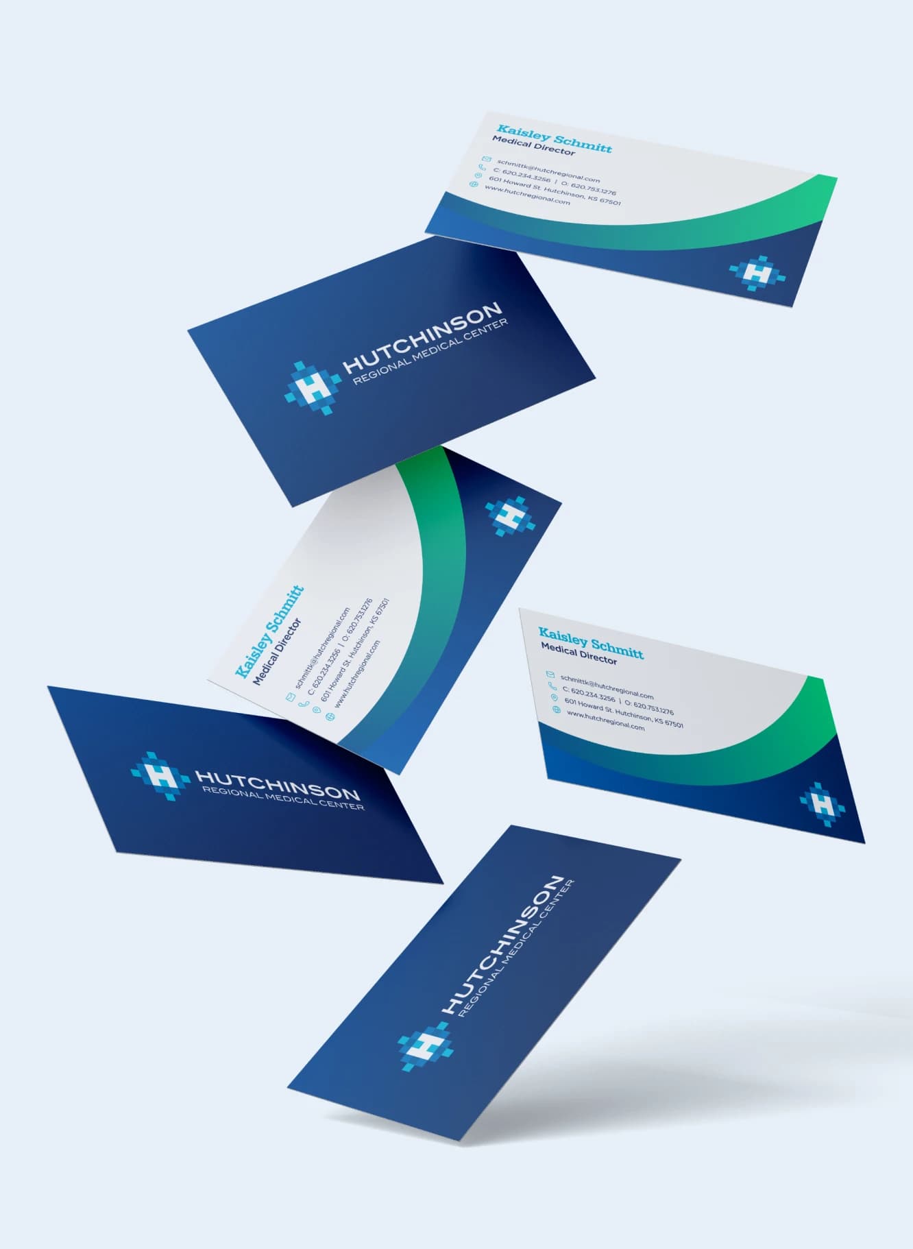
We built modular templates in Canva and Figma for daily use: print materials, recruiting collateral, digital signage, social graphics, presentations. Then we recorded walkthroughs showing exactly how to use these tools, created onboarding decks, and provided support for translating legacy materials. We aimed for adoption over perfection.
The messaging framework provided clear voice and tone guidance, audience-specific messaging, and sample language for recruitment, public health, and service lines. One-liners and talking points staff could use naturally—not scripted marketing speak, but language that made sense when someone asked about HRHS at a soccer game or church event.
Tak through what you are reading with the practitioners who wrote it.