.svg)
Get Started
Put these insights to work.
Tak through what you are reading with the practitioners who wrote it.
Helping a high-performance programmatic partner grow into its next era with sharper storytelling, a flexible brand system, and a digital experience built for scale.

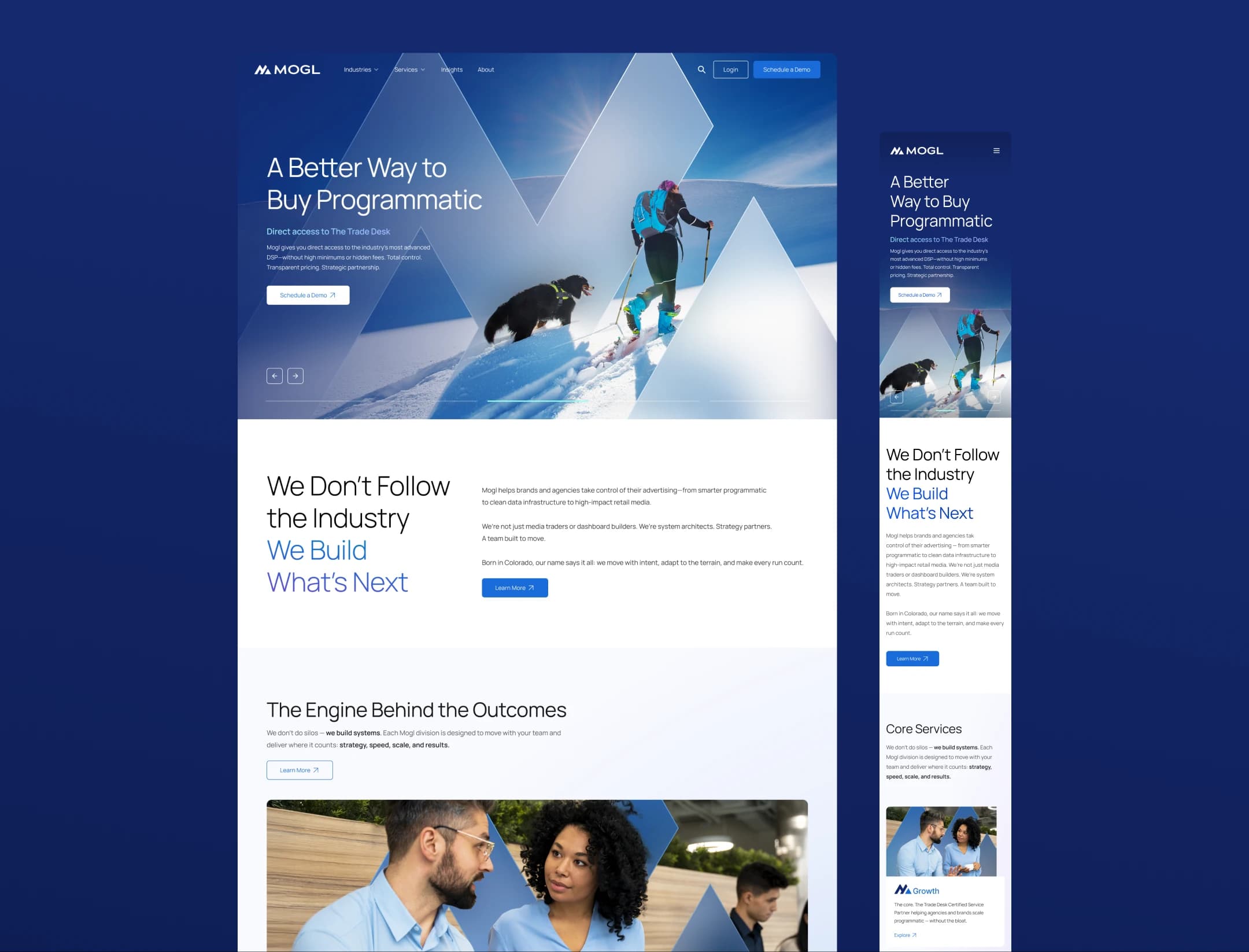
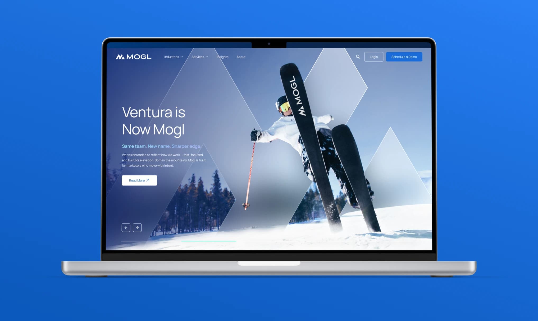
Ventura (now rebranded as Mogl) had built a strong reputation as the world's largest certified service partner of The Trade Desk. But the brand no longer reflected the full scope of their capabilities or their ambition. They weren't just onboarding clients to TTD. They were helping brands and agencies scale faster, smarter, and with more transparency than legacy vendors could offer. EA was brought in to lead the strategic rebrand, from stakeholder alignment through rollout.

Stakeholder interviews, competitive and market analysis, brand strategy and narrative, messaging framework, visual identity and brand system, information architecture, UX wireframes, website design, SEO
Helping a high-performance programmatic partner grow into its next era with sharper storytelling, a flexible brand system, and a digital experience built for scale.
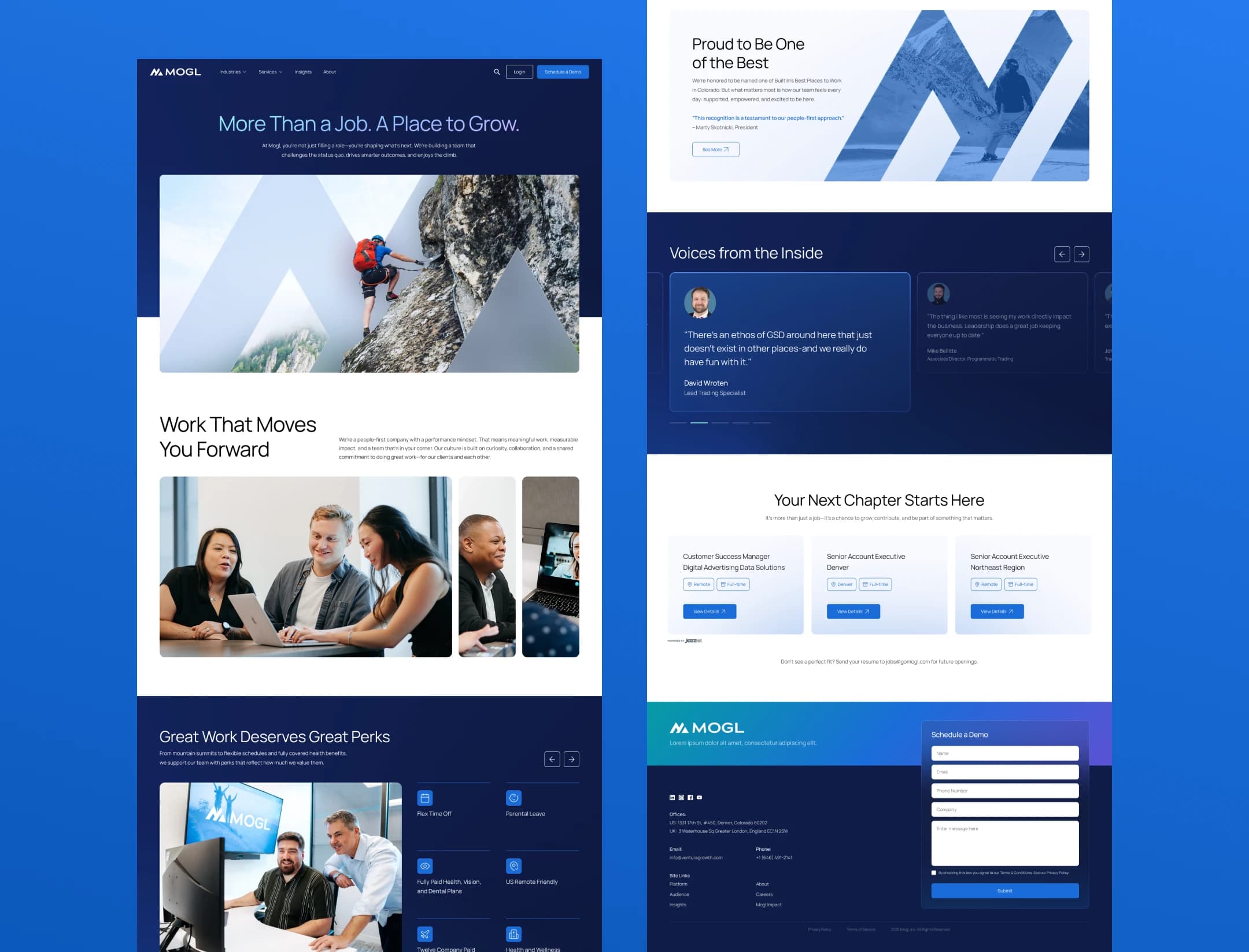
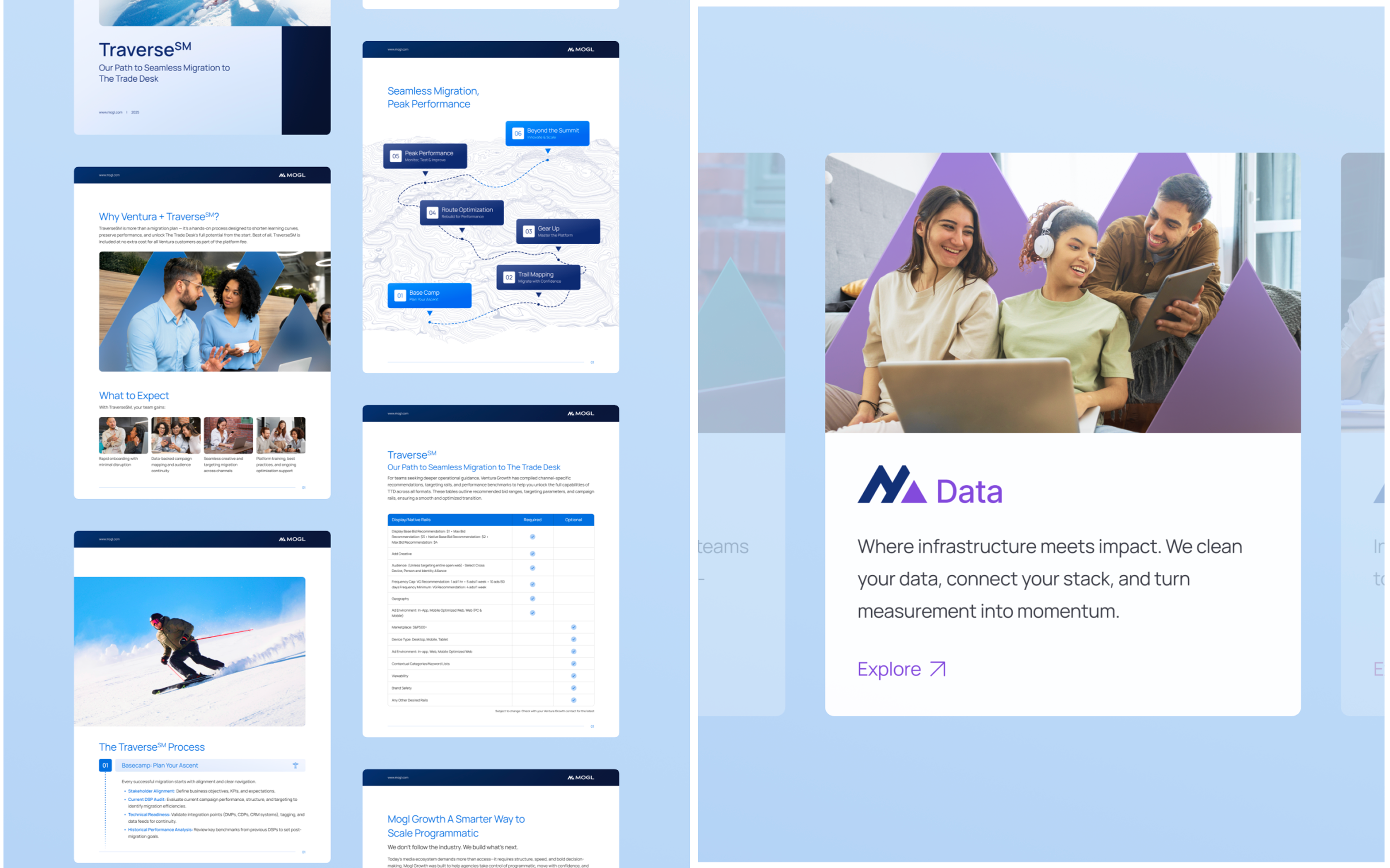
Denver-born, Mogl takes its name from the part of skiing where control, speed, and precision decide whether you survive the course or master it. That metaphor became the foundation for an identity that could navigate volatile markets with the same balance of agility and strength. The mark, typography, and terrain linework establish a clear visual grammar that feels grounded and energetic at the same time. Sub-brand structure, color palettes, iconography, and UI patterns extend that grammar across Retail, Data, Labs, and International without losing character. A comprehensive asset library supports the day-to-day reality of the business with logo and sub-brand lockups, grid and spacing rules, pattern variations, icon sets, UI components, and usage playbooks, so teams can move fast while the brand stays coherent. Mogl's modular architecture defines how verticals and initiatives connect back to the parent brand with consistent naming rules, visual hierarchy, and layout logic while maintaining flexibility to express its own role. The expandable toolkit was designed as infrastructure rather than decoration, which means new lines and campaigns can launch quickly, inherit credibility, and remain legible in any channel. Templates for decks, sales sheets, UI, and social ensure the same core structure travels across formats while leaving room for creative expression where it matters. The website proves the system under real conditions. Information architecture maps to buyer flows, modules adapt by audience, and proof points lead the narrative. The interface uses the same components defined in the brand system, so pages feel fast, clear, and confident. Accessibility, performance, and content governance are built in, which lets the team ship updates without reinventing patterns and keeps the experience aligned with the brand as it scales. What could have been a standard marketing site instead became the brand's first demonstration of its own principles: precision, momentum, and control.
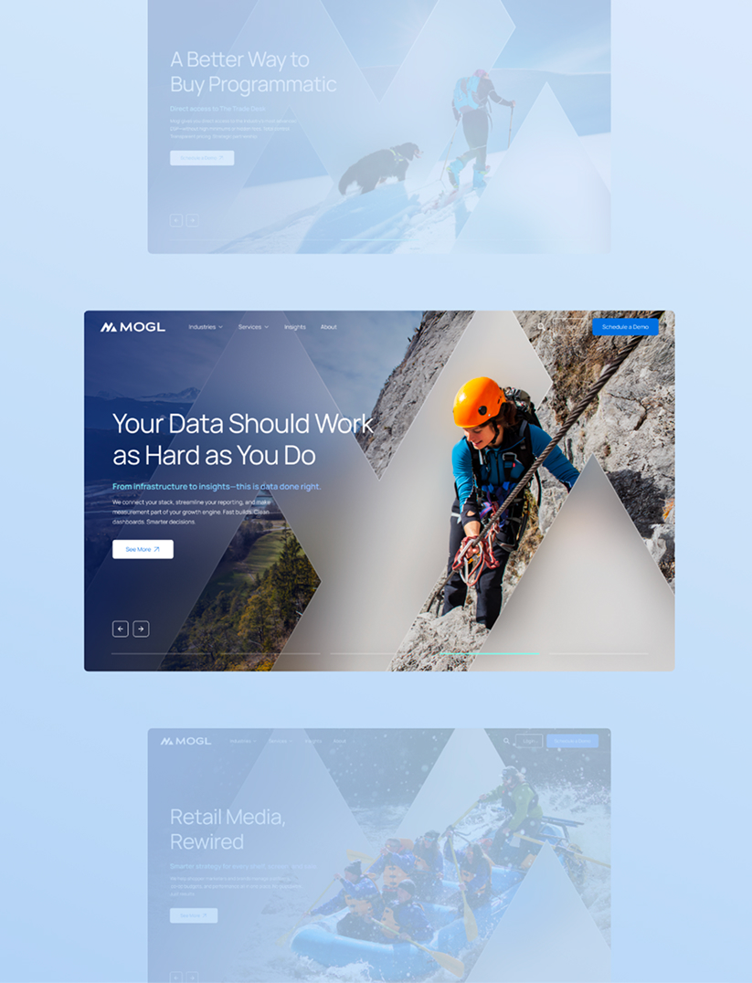
Service partners growing out of a parent-platform identity, and companies that need a sub-brand system that can expand into new verticals without losing coherence.
Tak through what you are reading with the practitioners who wrote it.