.svg)
Get Started
Put these insights to work.
Tak through what you are reading with the practitioners who wrote it.
Elevating a category leader with sharper positioning, a platform-first story, and a coach-first brand voice that moves like the product does.
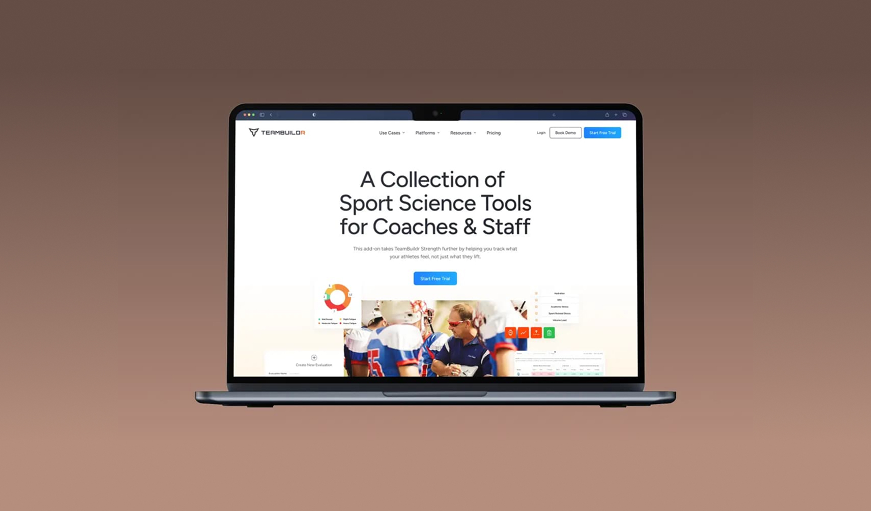
TeamBuildr is one of the most trusted names in strength and conditioning software, used by over 3,000 programs from high schools to pro teams. But their website didn't reflect their leadership, their personality, or the powerful new platforms they were bringing to market. They turned to Matic to help reimagine how their story (and product ecosystem) was told.
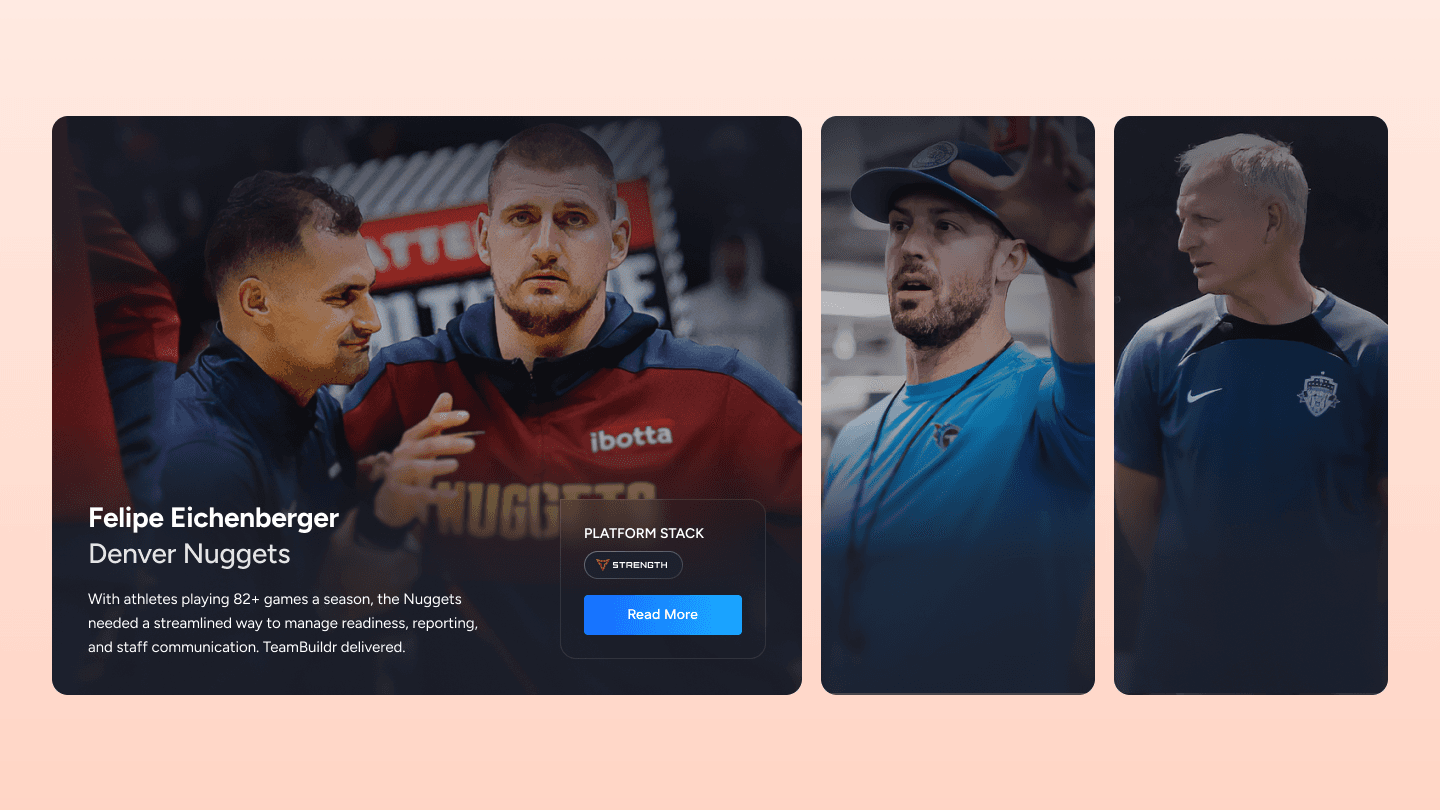
We partnered closely with TeamBuildr's internal team to rebuild their digital experience from the ground up: new IA, new messaging, new platform pages, and a fresh visual system that mirrors the confidence and clarity of the coaches they serve.
Brand strategy and positioning, information architecture, copywriting, UX/UI, on-page SEO, buyer journey mapping, content strategy, visual alignment
Elevating a category leader with sharper positioning, a platform-first story, and a coach-first brand voice that moves like the product does.
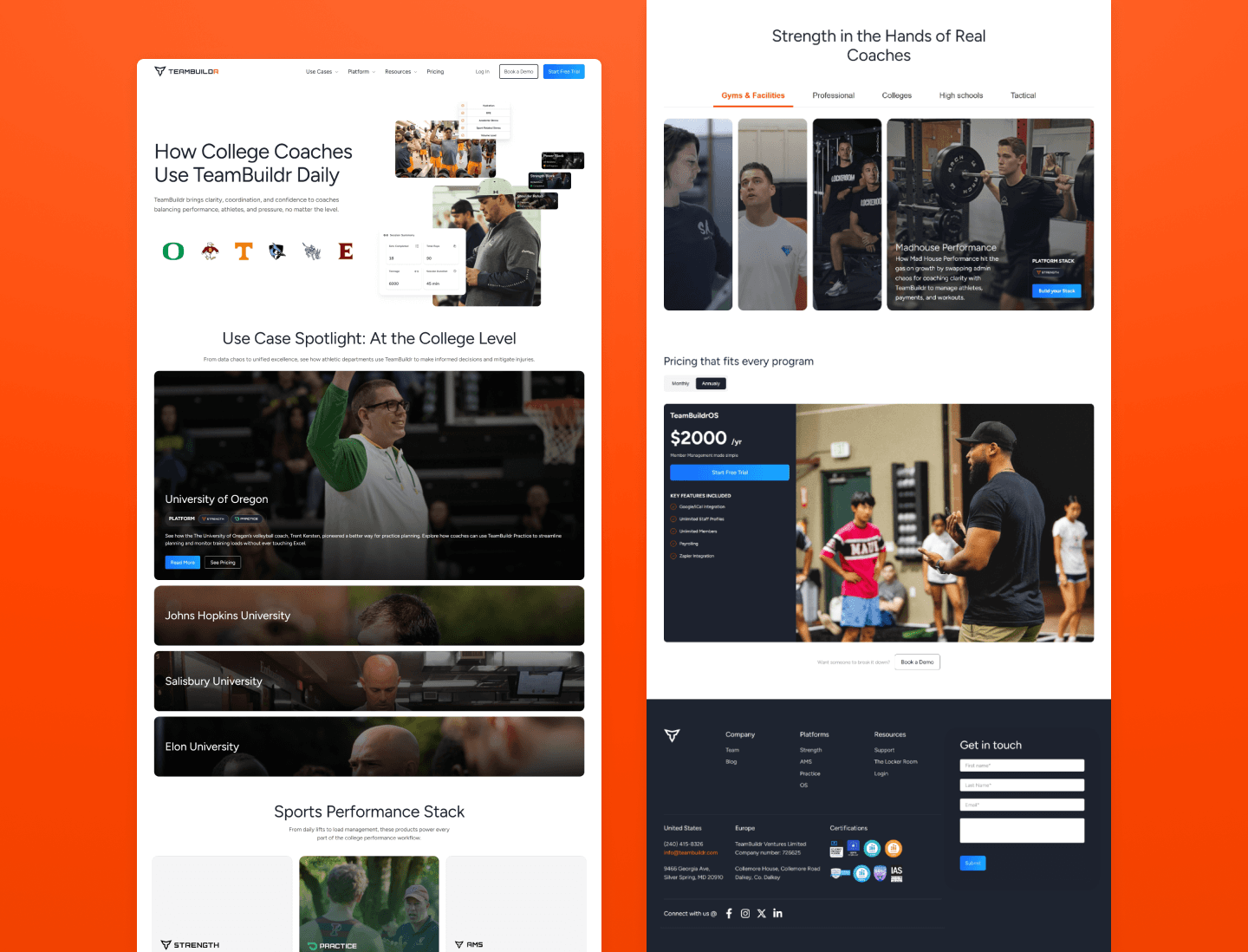
TeamBuildr had launched multiple new product lines, but their old site made them hard to find and harder to understand. We worked with their product and marketing teams to structure a clearer story across platforms, use cases, and customer types. Each page was purpose-built to help coaches find the tools they need, without sorting through marketing fluff. TeamBuildr's audience isn't made up of passive buyers. They're decisive, outcome-driven, and extremely good at sniffing out BS. So we leaned into a tone that respects their time and mirrors their mindset: direct, no-frills, and built on real benefits. By mirroring each persona's language, from pro-level precision to high school energy, we built trust, reduced bounce, and sped up decision-making across the site. We introduced a modernized visual system that aligns with TeamBuildr's expanded product offering and leadership in the category. Confident typography, sharper color logic, and UX components built for conversion elevated the experience without losing the brand's edge. From H1s to platform architecture, every element was designed to boost discoverability for key terms like strength training software, AMS, and performance coaching platform, without compromising tone or clarity. The result is a site that works as hard as the team behind it.
Category-leading software companies whose product suite has outgrown their site, and teams that need a coach-first or operator-first story instead of generic marketing language.
Tak through what you are reading with the practitioners who wrote it.